TD Accessibility Adapter

TD Accessibility Adapter

TD Accessibility Adapter

Led the redesign of the product with a new design system, launched in under five months

Redesigned the TD Accessibility Adapter with full ADA/WCAG 2.1 compliance by creating a unique design system from the scratch

Team

Team

Product Owner: Samantha Estoesta

Senior UX designer: Ron Kielstra


Developer: Matt Vollick, Isaiah Erb

Tool

Tool

Figma, Jira, Confluence

Overview

TD Accessibility Adapter is designed as a browser plug-in that enables users to personalize their online experience based on individual accessibility preferences.


As the one of the two UX/UI designer on this project, I helped the cross-functional team to address usability pain points, establish a cohesive design system, and guide the product from its pilot phase to internal launch over five months.

Overview

TD Accessibility Adapter a browser extension designed to help users personalize their digital experience based on individual accessibility preferences.


As one of two UX/UI designers on this project, I worked closely with a cross-functional team to tackle usability challenges, establish a cohesive design system, and guide the product from its pilot phase to a successful internal launch within five months.

Business Impact & Industry Recognition 🚀

Business Impact & Industry Recognition 🚀

Business Impact & Industry Recognition 🚀

This tool first launched internally to over 95,000 TD employees worldwide. After receiving overwhelmingly positive feedback, TD publicly released the tool on the Google Chrome Store in late 2023—making digital accessibility more inclusive for all users. You can download and try it here!


The impact extended beyond adoption:

  • Featured in Global News and Forbes, amplifying TD’s leadership in accessibility innovation.

  • Promoted through TD’s official marketing campaigns, including a dedicated tutorial video (see below).

  • Contributed to TD Bank being recognized as one of the Best Places to Work for Disability Inclusion at the 2023 Disability:IN Conference in the U.S.


This project not only improved web accessibility but also strengthened TD’s reputation as an inclusive employer and industry pioneer.

This tool first launched internally to over 95,000 TD employees worldwide. After receiving overwhelmingly positive feedback, TD publicly released the tool on the Google Chrome Store in late 2023—making digital accessibility more inclusive for all users. You can download and try it here!


The impact extended beyond adoption:

  • Featured in Global News and Forbes, amplifying TD’s leadership in accessibility innovation.

  • Promoted through TD’s official marketing campaigns, including a dedicated tutorial video (see below).

  • Contributed to TD Bank being named a Best Place to Work for Disability Inclusion at the 2023 Disability:IN Conference in the U.S.


This project not only improved web accessibility but also strengthened TD’s reputation as an inclusive employer and industry pioneer.

My role

My role

My role

In the 5 months, I

New and Improved Design

New and Improved Design

New and Improved Design

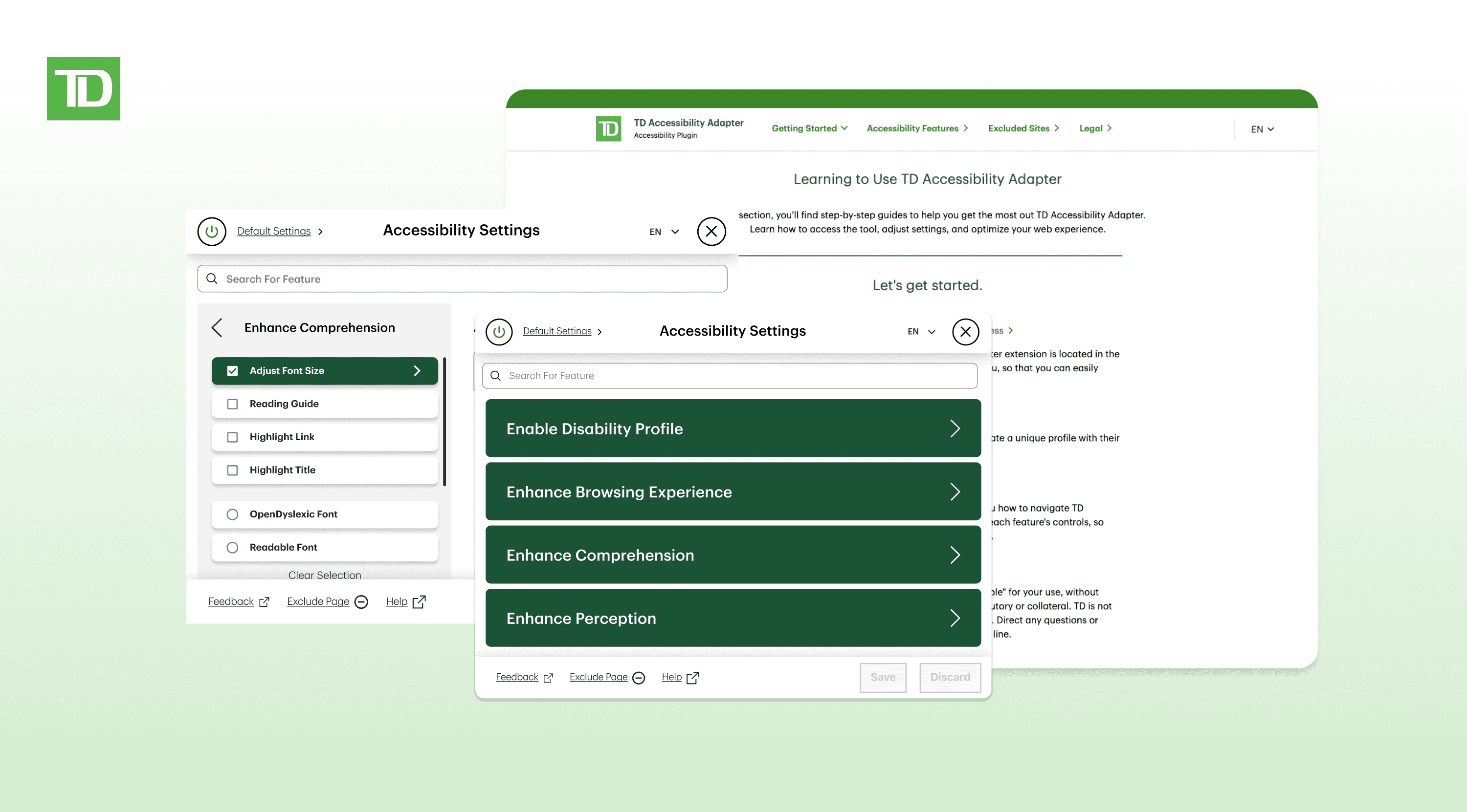
Tutorial Page: Users can access this tutorial web page by clicking the Help link on the TD Accessibility Adapter Chrome extension. The page offers a step-by-step walkthrough on how to use the product, along with a full overview of its features.

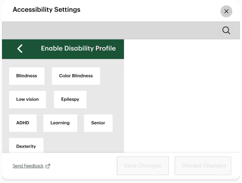
Managing a profile: Users can create and save personalized profiles with their own accessibility settings using the TD Accessibility Adapter.

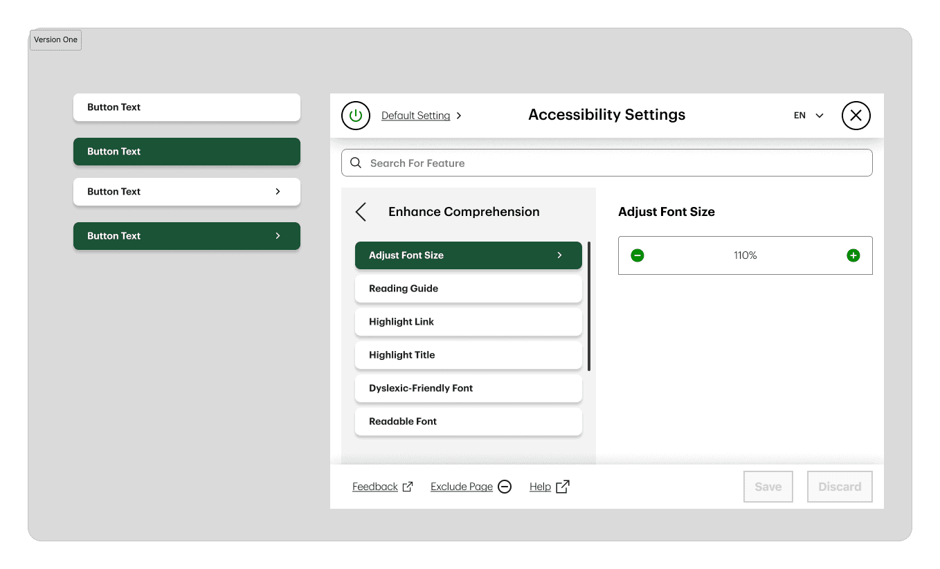
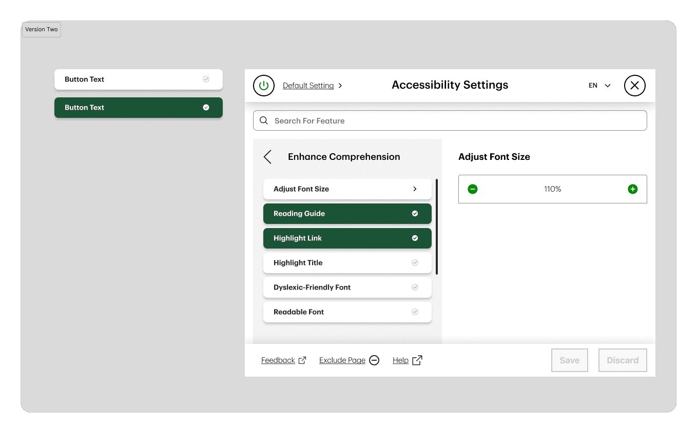
Selecting Feature options: Users can navigate the TD Accessibility Adapter to explore and activate individual features, adjusting each one to suit their specific needs for an improved web experience. With a total of 18 customizable features, users have full control over how content is presented.


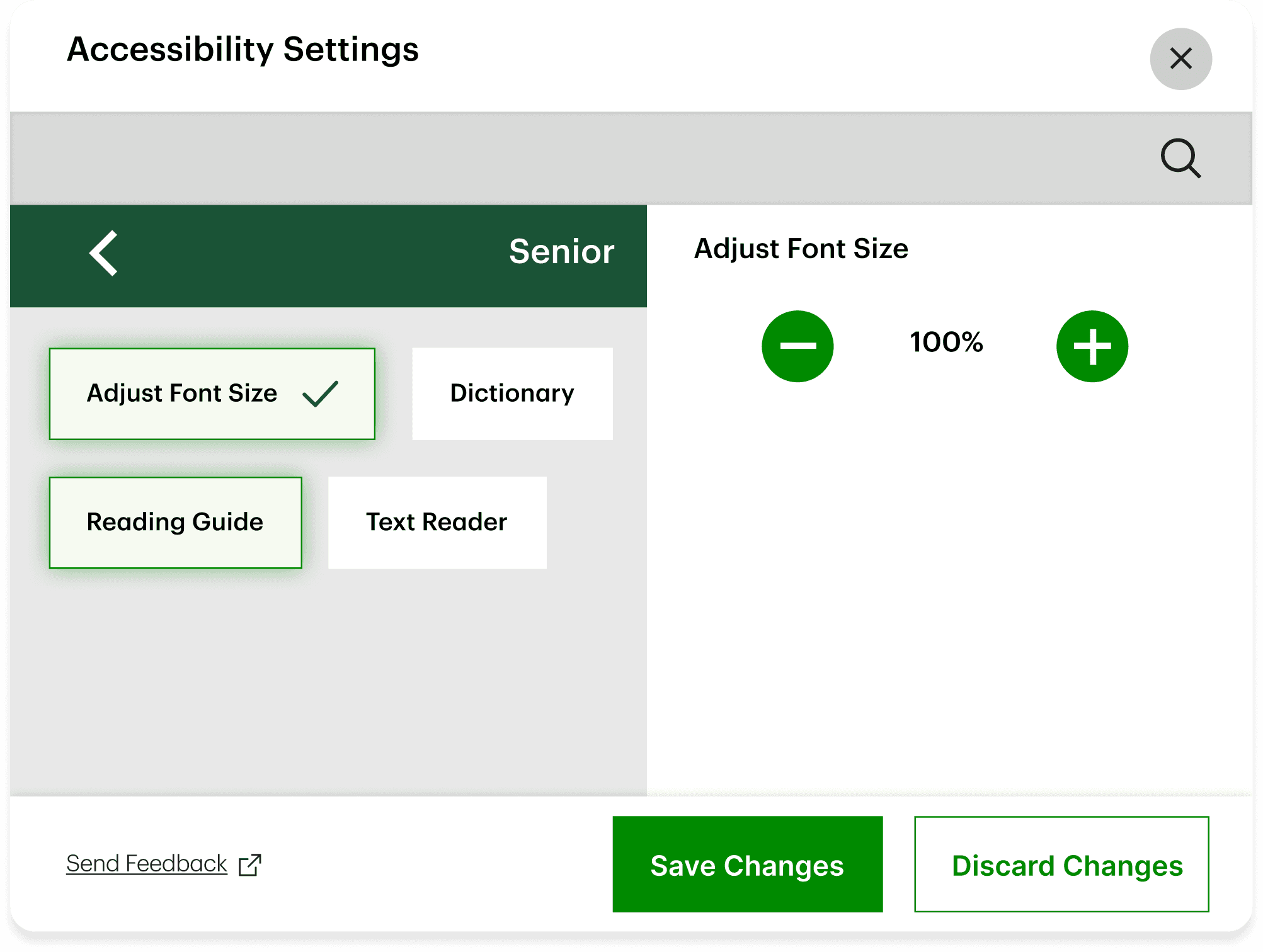
The example below shows how a senior user enables the Reading Guide and increases the font size to enhance readability.

Understanding the problem through user-testing

Why there is a need for redesign?

Why there is a need for redesign?

Why there is a need for redesign?

When I joined the team, the TD Accessibility Adapter was in its pilot version. I led the research study, working closely with our PO to identify key areas for improvement before the upcoming launch. I constructed the survey, starting with the Net Promoter Score questions, followed by qualitative questions. Several colleagues at TD also agreed to support user testing, and I took the lead in planning and facilitating these sessions to gather actionable feedback.

The Pilot version feedback were not good 🙁

The Pilot version feedback were not good 🙁

The Pilot version feedback were not good 🙁

The NPS score turned out to be 5.6/10, where 7 indicates moderate satisfaction and 9 indicates high satisfaction. This was a huge shock to my team because we all thought the product was ready for an internal launch in February. After gathering the data and feedback through synthesis, I led the team in identifying usability issues with the previous UI design.

The Problem:

The Problem:

The Problem:

Painpoint 1

Users Struggled to Parse Critical Features

Users Struggled to Parse Critical Features

  • The scattered and unappealing layout of the features list hampers user experience. which lead the users struggle to read and understand the features they want to enable.

Painpoint 2

Painpoint 2

Hidden Controls Left Users in the Dark

Hidden Controls Left Users in the Dark

  • Users don’t realize that some buttons contain additional controls (which appear in the left panel).

  • Many are unaware that they can select multiple features within the same setlist, reducing functionality and efficiency.

Painpoint 3

Painpoint 3

Inconsistent Design Confused Users

Inconsistent Design Confused Users

The UI lacks standardization, leading to a disjointed experience:

  • Button sizes and states behave differently across pages.

  • Typography, spacing, and visual hierarchy are inconsistent.

Design Challenge:

Design Challenge:

Design Challenge:

Solution

A Unified Design System & Web Tutorial Page

A Unified Design System & Web Tutorial Page

A Unified Design System & Web Tutorial Page

By unifying the product's design language, we enhanced visual consistency and usability across the entire interface. Standardized components, predictable interactions, and cohesive styling eliminated confusion while making features more discoverable. This approach not only improved the user experience but also streamlined design and development workflows.

To further support users, we created an interactive web tutorial featuring clear, step-by-step visual guides that walk first-time visitors through key features and functionalities.

Developing a Design System

Developing a Design System

Developing a Design System

  1. Cataloging Visual Elements
Cataloging Visual Elements

We began by conducting an audit of the current version of the UI. I cataloged every visual element present on the adapter, including buttons, input fields, search bars, and notifications...

  1. Comparison with the existing TD Design System
Comparison with the existing TD Design System

Next, I conducted a thorough comparison, identifying corresponding visual elements within the existed TD emerald design system.

  1. Development of Reusable Tokens and Variables
Development of Reusable Tokens and Variables

I collaborated closely with the senior designer, leveraging the guidelines outlined in the TD emerald design system. Together, we developed a set of unique reusable tokens and variables tailored specifically to the requirements of this accessibility adapter.

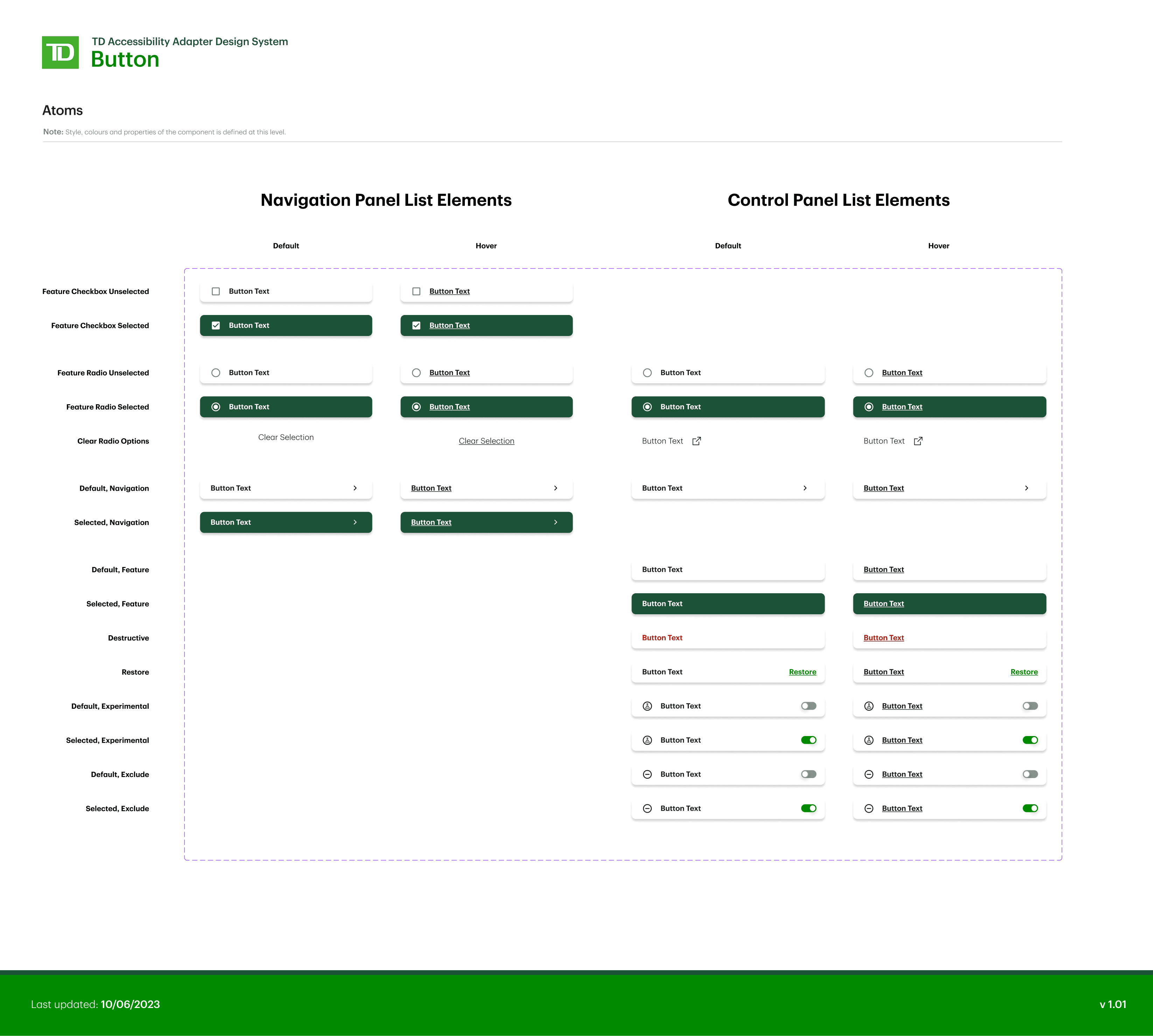
Final Button Design in the Design System

All the other visual elements in the Design System

All the other visual elements in the Design System

Iterative Process

The button design was challenging

The button design was challenging

The biggest challenge of creating the design system was the button design. We had multiple iterations before deciding the final design.

Issue

Pilot Version Design

Pilot Version Design

The button size in the pilot design was too small, and the layout appeared scattered, making it hard to read.

Users were also unaware they could select multiple features at once, and some buttons had additional controls on the next page.

Problem:

The button size in the pilot design was too small, and the layout appeared scattered, making it hard to read.

Users were also unaware they could select multiple features at once, and some buttons had additional controls on the next page.


Solution:

The accessibility adapter uses a split-view (two-pane) layout, similar to the iOS iPad Split View and sidebar design. Inspired by iOS best practices, I standardized the button size to match the sidebar size.

For buttons with additional controls, such as font size adjustments, I added a right arrow icon to indicate navigation.

Issue

Version 1 Design

Version 1 Design

After testing, users still have no idea that they could select multiple features at the same time.

Problem:

After testing, users still have no idea that they could select multiple features at the same time.


Solution:

I then implemented checkmark icon to allow users to select multiple features at the same time.

Issue

Version 2 Design

Version 2 Design

Despite adding a checkmark icon, users still misunderstood its function, mistaking it for a button selection indicator.

We also identified a conflict between Dyslexic-Friendly Fonts and Readable Fonts, as users must choose one option exclusively, complicating their integration with the multi-select features at the top.

Problem:

Despite adding a checkmark icon, users still misunderstood its function, mistaking it for a button selection indicator.

We also identified a conflict between Dyslexic-Friendly Fonts and Readable Fonts, as users must choose one option exclusively, complicating their integration with the multi-select features at the top.


Solution:

After stakeholder discussions and reviewing Material Design guidelines, we added radio buttons and checkboxes to the design.


We created three sets: navigation checkboxes, standard checkboxes, and radio buttons. Although combining them was a design trade-off, user testing confirmed it worked for this unique case.

To minimize confusion, we organized features into multi-select (checkboxes) and mutually exclusive (radio buttons) categories. A clear selection button was added below the radio buttons to allow users to easily deselect options, which required aligning with developers on expected behaviors.

Final Button Design

Final Button Design

Learnings: This project was truly a game changer for me

Learnings: This project was truly a game changer for me

Learnings: This project was truly a game changer for me

  1. Always work with the design system.
Always work with the design system.

Creating a design system from scratch was a lot of work, but it was also a great learning experience. It taught me how essential design systems are for scaling products and companies effectively. It changed my approach to design and allowed me to learn new technical skills in Figma. I became proficient in auto-layout and component creation for projects.

  1. Collaboration and Communication is the key to success.
Collaboration and Communication is the key to success

The success of this project was made possible by the collaborative efforts of my talented team. Every change we made required discussions not only with the product manager and the development team but also with the legal team to ensure feasibility within the bank. Additionally, we regularly scheduled meetings with Digital Accessibility Coaches from the team for multiple feedback sessions, ensuring compliance with TD accessibility standards and ADA/WCAG 2.1 before the launch.

  1. Launching a product wasn't easy.
Launching a product wasn't easy.

From redesigning to the official internal launch, the journey took 5 months. I'm incredibly grateful for the opportunity to experience the entire process from start to finish. From initial testing to finally completing the redesign, there were numerous trade-offs we had to make to comply with legal regulations within the bank. Despite the challenges, the outcome was rewarding.

Iterative Process

The button design was challenging

The biggest challenge of creating the design system was the button design. We had multiple iterations before deciding the final design.

Pilot Version Design

Problem:

The button size in the pilot design was too small, and the layout appeared scattered, making it hard to read.

Users were also unaware they could select multiple features at once, and some buttons had additional controls on the next page.

Solution:

The accessibility adapter uses a split-view (two-pane) layout, similar to the iOS iPad Split View and sidebar design. Inspired by iOS best practices, I standardized the button size to match the sidebar size.

For buttons with additional controls, such as font size adjustments, I added a right arrow icon to indicate navigation.

Version 1 Design

Problem:

After testing, users still have no idea that they could select multiple features at the same time.

Solution:

I then implemented checkmark icon to allow users to select multiple features at the same time

Version 2 Design

Problem:

Despite adding a checkmark icon, users still misunderstood its function, mistaking it for a button selection indicator.

We also identified a conflict between Dyslexic-Friendly Fonts and Readable Fonts, as users must choose one option exclusively, complicating their integration with the multi-select features at the top.

Final Button Design

Solution:

After stakeholder discussions and reviewing Material Design guidelines, we added radio buttons and checkboxes to the design. We created three sets: navigation checkboxes, standard checkboxes, and radio buttons. Although combining them was a design trade-off, user testing confirmed it worked for this unique case.

To minimize confusion, we organized features into multi-select (checkboxes) and mutually exclusive (radio buttons) categories. A clear selection button was added below the radio buttons to allow users to easily deselect options, which required aligning with developers on expected behaviors.

© Janice Wang 2025🧡

© Janice Wang 2025🧡