Solace Pubsub+ Event Portal

Solace Pubsub+ Event Portal

Led UX for new features in PubSub+ Event Portal 2.0

Team

Team

1 UX Manager
4 UX Designer

4 Senior Developers

Tool

Tool

Figma, JIRA, Confluence

Time

Time

4 months

Overview

I interned with the Solace PubSub+ Event Portal team during a key transition from version 1.0 to 2.0, a major update that introduced new features to enhance the platform’s functionality. My work focused on improving the user experience for system architects working with real-time data streaming.

During my time with the team, I reestablished font styles to enhance web accessibility, created reusable wireframe components for faster design communication, and designed new features to support updated user flows.

What does Solace do?

What does Solace do?

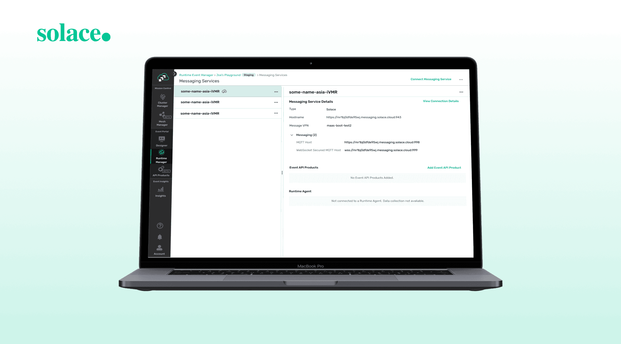
Solace helps businesses (B2B) share real-time data across their systems. Its PubSub+ Platform makes it easy to stream and manage data from start to finish, ensuring seamless flow between apps, clouds, and devices. This allows companies to react to events faster and handle complex information more efficiently.

From a UX standpoint, the platform focuses on making this complexity more accessible, helping users easily monitor, organize, and act on real-time data.

Projects I have worked on

Projects I have worked on

Projects I have worked on

Reestablished Font Styles to Improve Web Accessibility


Problem:

One of the main goals of the PubSub+ Event Portal was to improve web accessibility. However, the platform’s text styling didn’t use proper semantic HTML headers (such as <h1> to <h6>). This made it difficult for screen readers to navigate and interpret the content effectively, limiting the platform’s usability for visually impaired users.

Solution:
I conducted a full audit of the platform’s typography and identified all existing text styles. I streamlined them into 7 consistent styles and mapped each one to a semantic header tag, supporting better screen reader navigation. I also renamed and structured them using Material Design 2 guidelines, improving both accessibility and the overall visual clarity of the interface.

Designed Two New Features to Enhance Existing User Flows


As part of the PubSub+ Event Portal 2.0 upgrade, new functionalities were added to the software, requiring updates to the user interface to support these changes. I was responsible for designing two new features that enhanced existing flows. Working closely with senior developers and the design lead, I reviewed the original feature designs and redesigned them to integrate the new capabilities while maintaining a seamless user experience.

To support implementation, I created detailed specs for developers and team members to reference during implementation. These specs outlined all key interface behaviors and design details, accompanied by user story scenarios and visual mockups to ensure clarity for non-designers. My goal was to make the document organized, scannable, and self-explanatory.

Created Wireframe Components for Faster Design Communication


Problem:


When designers on the team needed to create quick wireframe mockups for stakeholders and developers, they had to manually build them in Figma from scratch. This led to inconsistent wireframes across the team, making communication less efficient and harder to interpret.

Solution:

I conducted an audit of all existing wireframe files created by the design team and identified common patterns. Based on their current design system and design guideline, I created a new set of wireframe components that matched every existing symbol. This allowed designers to quickly build consistent and accurate wireframes, saving time and improving clarity when sharing ideas with stakeholders and developers.

Learnings:

Learnings:

Learnings:

  1. Navigating a Complex, Technical Domain
Navigating a Complex, Technical Domain

When I first started at Solace, I found the PubSub+ cloud domain to be highly technical and filled with unfamiliar terminology. This made it difficult to fully understand the product and clearly explain my design concepts. To overcome this, I made it a habit to thoroughly prepare before meetings by researching relevant terms and anticipating what might come up in conversations. I also started recording meetings to ensure no feedback was lost(with consent). Over time, I became more confident in asking clarifying questions and simplifying complex information, which helped me better contribute in a highly technical environment.

  1. Communicating Effectively with Developers and Designers
Communicating Effectively with Developers and Designers

Collaborating closely with senior developers taught me how to present design ideas in a way that’s clear, actionable, and grounded in technical feasibility. Early on, I struggled to convey my design intentions in a way that aligned with the development process, but through practice, I learned to craft specs that were organized, scannable, and self-explanatory.
On the design side, participating in twice-weekly review meetings helped me improve how I presented my ideas and gave me more opportunities to confidently voice my input. Over time, I became more active in team discussions and better equipped to contribute meaningfully to both design and cross-functional collaboration.

© Janice Wang 2025🧡

© Janice Wang 2025🧡